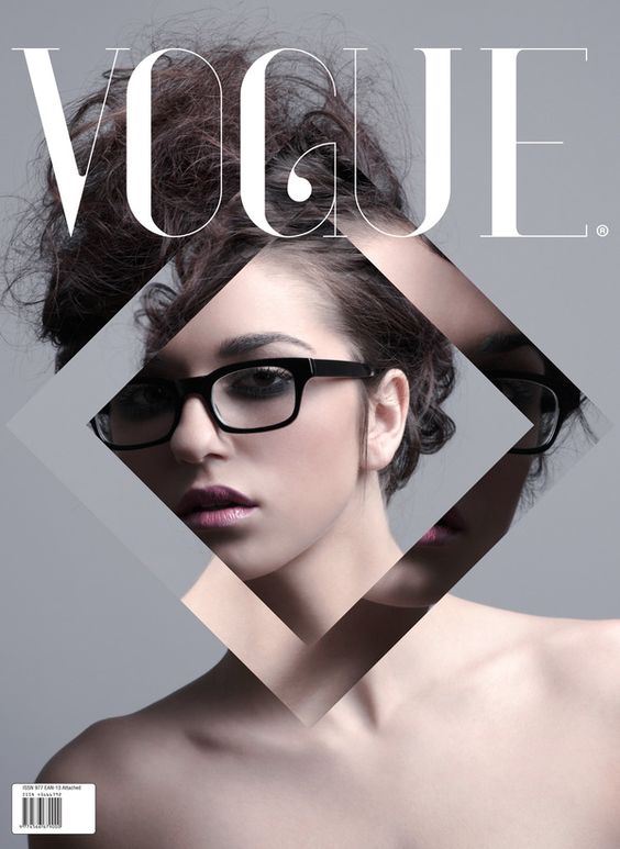
I feel very inspired by VOGUE's cover images. While they have more sophisticated pictures and generally opt for portraits, I believe that they are a good magazine to build off of since they were established in 1892. I think that including a person in my cover page is the best choice, I can place objects or graphic elements in the content page to diversify the magazine.I really like the idea of having a central image or abstract objects in the content page to intrigue readers.
 These two examples that I think are very interesting to look at and I would like to recreate a few elements shown. I think I should incorporate both black and white as well as color to diversify my magazine. Having a simple page and use of abstract images and color will benefit me because of my target audience. I believe that by incorporating these elements in my magazine will allow it to flow smoothly from one page to the next. Hopefully it will be as good as these examples.
No comments:
Post a Comment